Now more than ever, the way we access and interact with websites continues to undergo significant transformations. With the proliferation of smartphones, tablets, and an array of internet-enabled devices, ensuring a seamless user experience across various screen sizes has become paramount. This is where responsive web design comes into play.
In this blog, we will delve into the world of responsive web design, exploring its fundamental concepts, benefits, and importance. We will uncover the key elements that make a website responsive and discuss the role it plays in enhancing user engagement, improving search engine visibility, and maximising conversions. So, whether you’re a web developer, business owner, or simply curious about the evolving web landscape.
Get ready to discover the power of adaptive design and how it can revolutionise your online presence. Let’s dive in and explore why responsive web design is not just a trend, but a crucial aspect of modern web development.
What is Responsive Web Design?
Responsive web design is a design approach that allows websites to adapt and respond to the user’s device, regardless of its screen size or orientation. It enables the creation of websites that deliver a consistent and optimised experience, whether accessed on a desktop computer, a smartphone, or a tablet.
To achieve this, the website developer would program several CSS (Cascading Style Sheets), a language used to explain the presentation of a document. This can be in HTML or XML media queries, and use a variety of mix of flexible grids, layouts and images to achieve a fully-dynamic design.
This means that once the developer has completed the appropriate code, the web page should respond to the user’s device, and the screen on which it’s being viewed, including the size, platform, and orientation. Because this has to be built into every page of a website, it is best to build in responsiveness to the site during the initial build rather than having to go and add it in later, which can be very difficult and time-consuming.
For instance, a user could view a webpage on their laptop, and then view the same page on their tablet, and the page would automatically switch to accommodate the change in resolution. Doing this successfully means there is no need to develop a new website design and layout for every new device that enters the market. It provides a seamless experience and a better user experience. This means they are more likely to remain on your page and view your content rather than bounce off.
Key Features of Responsive Web Design
When it comes to creating a website that seamlessly adapts to different devices and screen sizes, responsive web design incorporates a set of key features that enable this fluidity and flexibility. These features work in harmony to ensure a consistent and optimal user experience across all platforms. Let’s take a closer look at some of the crucial components that make responsive web design stand out:
Fluid Grids
The tech industry is a dynamic and highly competitive marketplace, where a multitude of devices coexist with varying screen resolutions and orientations. This diversity poses a significant challenge for displaying content consistently across different platforms. In addition to this, some desktop users don’t maximise their browsers, resulting in an almost infinite number of potential screen sizes.
Responsive web design offers a compelling solution to this complex puzzle. By adopting a flexible approach, every element on a webpage can adapt effortlessly. Images become resizable, and layouts employ inventive workarounds to ensure they never break. In essence, responsive web design leverages the power of fluid grids and images that intelligently adjust their position and size, depending on the screen resolution they are displayed on.
This flexibility lies at the core of responsive web design’s effectiveness. It empowers websites to seamlessly accommodate a broad range of devices, from large desktop screens to compact mobile displays, without sacrificing the integrity of the content. By embracing this approach, businesses and individuals can deliver an optimal user experience, irrespective of the device or browsing habits of their visitors.
Flexible Images and Media
In addition to fluid grids, another crucial aspect of responsive web design is resizing images to suit varying screen resolutions. The good news is that several CSS coding techniques can be employed to achieve this seamlessly. By leveraging these techniques, you can ensure that your images maintain their visual appeal while fitting appropriately within the available screen space.
For those using WordPress, there are handy plugins available that streamline the image resizing process and enhance responsiveness. Let’s explore a few notable plugins:
ShortPixel: This powerful plugin offers image compression capabilities, with an average reduction in file size of up to 90%. By optimising your images, ShortPixel enables faster loading times and improved responsiveness for your website.
TinyPNG: Widely recognised for its efficiency, TinyPNG specialises in compressing PNG images without compromising their quality. With this plugin, you can significantly reduce the file size of your images while preserving their visual integrity.
EWWW Image Optimiser: Another popular choice, EWWW Image Optimiser, provides automatic image optimisation and compression. By reducing the size of your images, this plugin helps optimise responsiveness and ensures a smooth browsing experience for your visitors.
By incorporating these plugins into your WordPress website, you can automate the image compression process and effortlessly optimise the responsiveness of your site. These tools work behind the scenes to maintain image quality while minimising file sizes, resulting in faster load times and enhanced user experiences across devices.
Media Queries
Media queries serve as a cornerstone of responsive web design, offering a powerful mechanism for adapting websites to the unique characteristics of each user’s device. By utilising media queries, web developers can define specific CSS rules and styles that are applied based on the screen size, orientation, and resolution of the device.
The primary purpose of media queries is to enable the creation of responsive layouts and designs that seamlessly adjust to different screen sizes. Through the use of breakpoints, developers can specify specific ranges of screen widths at which the layout should change to accommodate the varying dimensions.
For example, a media query might be set to trigger when the screen width reaches a certain threshold, such as 600 pixels. At this breakpoint, the website can transition from a traditional desktop layout to an optimised and streamlined design tailored for tablets or smaller devices.
Beyond screen size, media queries can also target other device characteristics. They can detect the device’s orientation, distinguishing between portrait and landscape modes. This allows developers to create specific layouts or styles that are better suited for each orientation, enhancing the user experience.
Additionally, media queries can consider factors like resolution or pixel density. By differentiating between high-resolution and low-resolution screens, developers can provide sharper images and crisper graphics for devices capable of displaying them, ensuring optimal visual quality.
By leveraging media queries effectively, websites can offer a tailored experience for users across a wide range of devices. Whether it’s a large desktop monitor, a tablet held in portrait mode, or a smartphone with a high pixel-density screen, media queries enable websites to adjust their styles, layouts, and even content presentation to optimise readability and usability.
Mobile ‘Hiding’
Sometimes you can try your best to replicate a desktop webpage on a mobile device, but there comes a point where you don’t want all the information displayed on a desktop site to appear on a mobile site.
Showing and hiding content on mobile websites, also known as “mobile hiding,” has been a common practice in responsive web design to enhance the user experience on smaller screens. However, it’s important to consider the impact of such techniques on SEO efforts.
In the past, there were concerns that search engines might penalise websites for hiding content, considering it an attempt to manipulate search rankings. However today, search engine algorithms have evolved to understand and accommodate the use of responsive design techniques, including content hiding or prioritisation for mobile devices. As a result, in most cases, showing and hiding content on mobile websites is unlikely to have a negative impact on SEO.
That being said, it’s crucial to implement content-hiding techniques responsibly and in a way that aligns with search engine best practices. Here are a few key considerations to ensure a positive SEO impact:
Avoid “Cloaking”: Cloaking refers to intentionally serving different content to search engines than what is presented to users. This practice is against search engine guidelines and can result in penalties. Make sure that the content shown to search engines and users is consistent and relevant.
Use Structured Data: When hiding content, it’s essential to provide structured data markup that accurately represents the hidden content. This helps search engines understand the purpose and context of the hidden content, ensuring it is properly indexed and considered for relevant search results.
Prioritise Important Content: While hiding non-essential or secondary content on mobile devices can enhance the user experience, be cautious not to hide crucial content that is important for SEO purposes. Ensure that essential keywords, headings, and information that contribute to the overall relevance of the page are readily accessible and visible to both users and search engines.
Performance Optimisation
In the context of responsive web design, performance optimisation plays a vital role in delivering a seamless user experience on mobile devices. Mobile users can experience unique challenges such as slower internet connections, limited bandwidth, and lower processing power. Over time, it’s likely these limitations will become redundant but for now, it’s something you should consider.
Optimising website performance becomes crucial to ensure fast-loading and responsive mobile experiences. Here are some reasons why performance optimisation is essential for responsive web design:
Faster Loading Times
Mobile users often have less patience when it comes to waiting for a website to load. Studies have shown that even a slight delay in page load time can result in increased bounce rates and decreased user engagement. By implementing performance optimisation techniques, such as minimising file sizes, reducing server requests, and leveraging caching mechanisms, websites can significantly improve their loading times. This enhances the user experience, reduces bounce rates, and increases the likelihood of user retention.
Bandwidth Efficiency
Mobile devices are often connected to cellular networks with limited bandwidth. Optimising performance ensures that websites consume less data, resulting in cost savings for users and a smoother browsing experience. Techniques like image compression, lazy loading, and efficient resource handling help reduce the amount of data transferred, making the website more accessible and user-friendly for mobile users.
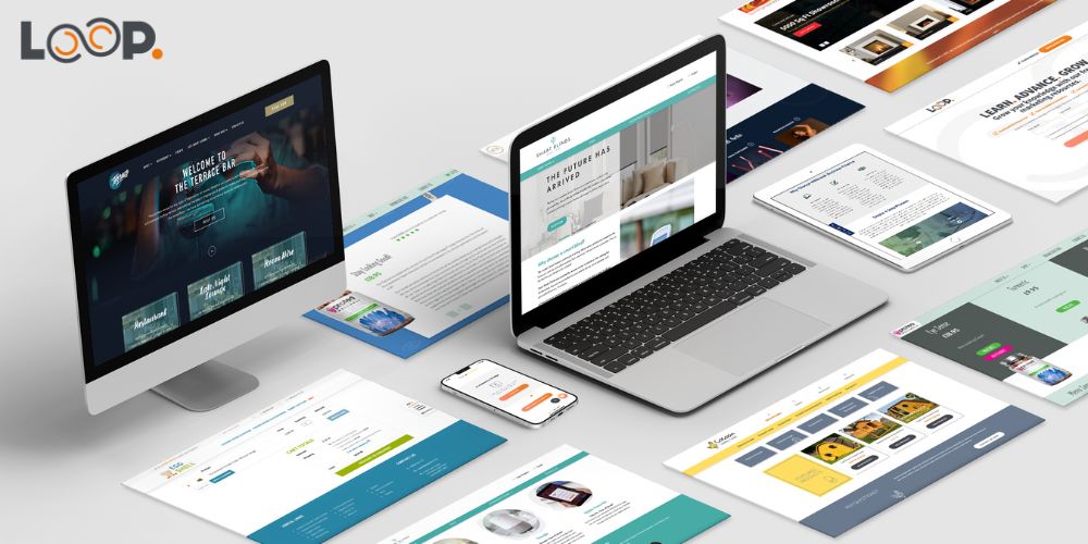
Responsive Web Design at Loop Digital
At Loop Digital, all of the websites we design and build are bespoke, created with your business and your audience at the forefront of every decision we make. Get more information on our range of forward-thinking web design solutions or visit our blog for more information. Alternatively, if you’re looking to take your business to the next level, get in touch with our team of experts today.
Paul is an invaluable member of our team, serving as a versatile and highly skilled Web Developer. With a strong commitment to continuous growth and a desire to excel in various areas, he embodies the spirit of a true jack of all trades. Paul thrives on challenges and takes immense pleasure in designing and transforming websites to maximise their potential. His ability to uncover the underlying purpose of a site and consistently optimise it is a testament to his dedication and expertise.
Paul’s enthusiasm lies in witnessing tangible results, as he takes immense pride in the outcomes of his efforts. He completed his university education in Electronic Media Design, laying a strong foundation for his technical prowess. Since joining Loop in 2020, Paul has continued to expand his knowledge base, constantly building upon his existing skills to stay at the forefront of industry advancements. Beyond his professional endeavours, Paul finds solace in his passions outside of work. His love for motor racing, clay pigeon shooting, and American football further exemplify his dynamic nature and drive for excellence. His versatility as a Web Developer, coupled with his passion for continuous improvement, sets him apart in the industry. With Paul’s expertise, clients can expect transformative websites, optimised for success and designed to surpass expectations.
Looking for your next opportunity?
Digital marketing careers
We’re always on the lookout for talented individuals to join our ever growing team. If you think you’d be a great match for Loop Digital, we’d love to hear from you.


